A selection of identities, websites and creative systems created for clients across different industries
Feel-good projects
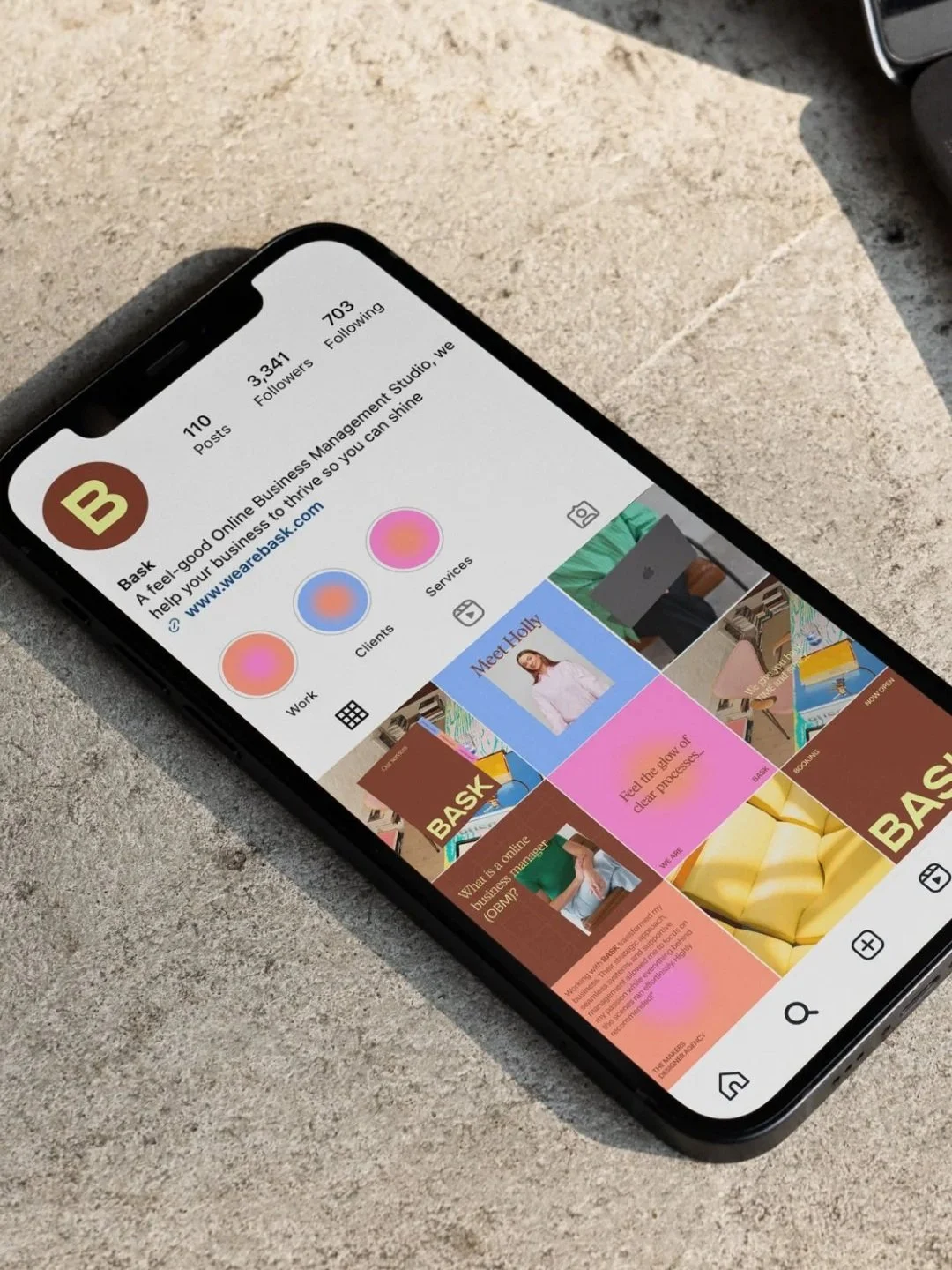
Bask
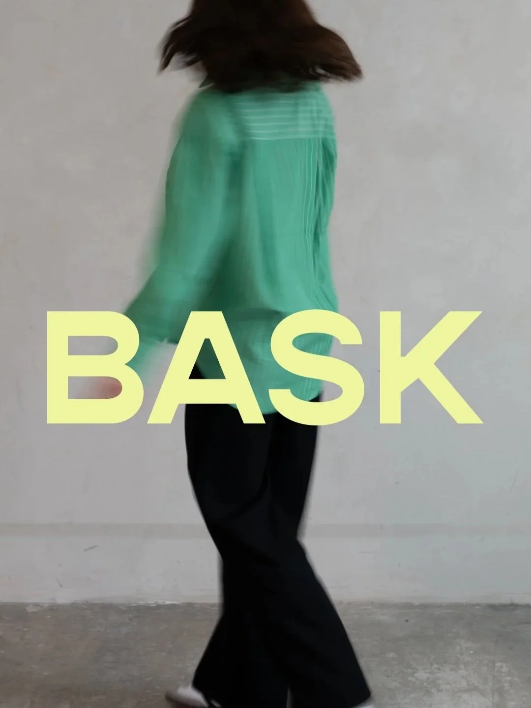
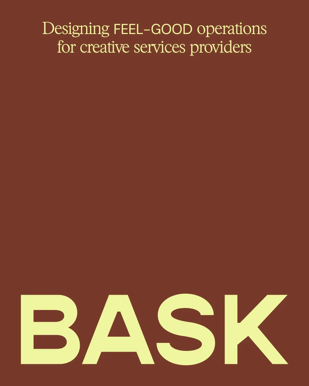
We worked with Holly to build a brand that truly reflects her mission; designing feel-good operation for creative service providers, allowing them to reclaim their energy and joy while building a business that supports the life they dream of.
The identity is designed to feel polished yet playful, a balance of professionalism and warmth. Using a refined, sophisticated colour palette while thoughtful design details add a sense of enjoyment. We incorporated structured graphics alongside fluid patterns and imagery, capturing both clarity and joy.
BRAND IDENTITY // SOCIAL MEDIA // WEBSITE DESIGN + BUILD
Weekend:IN
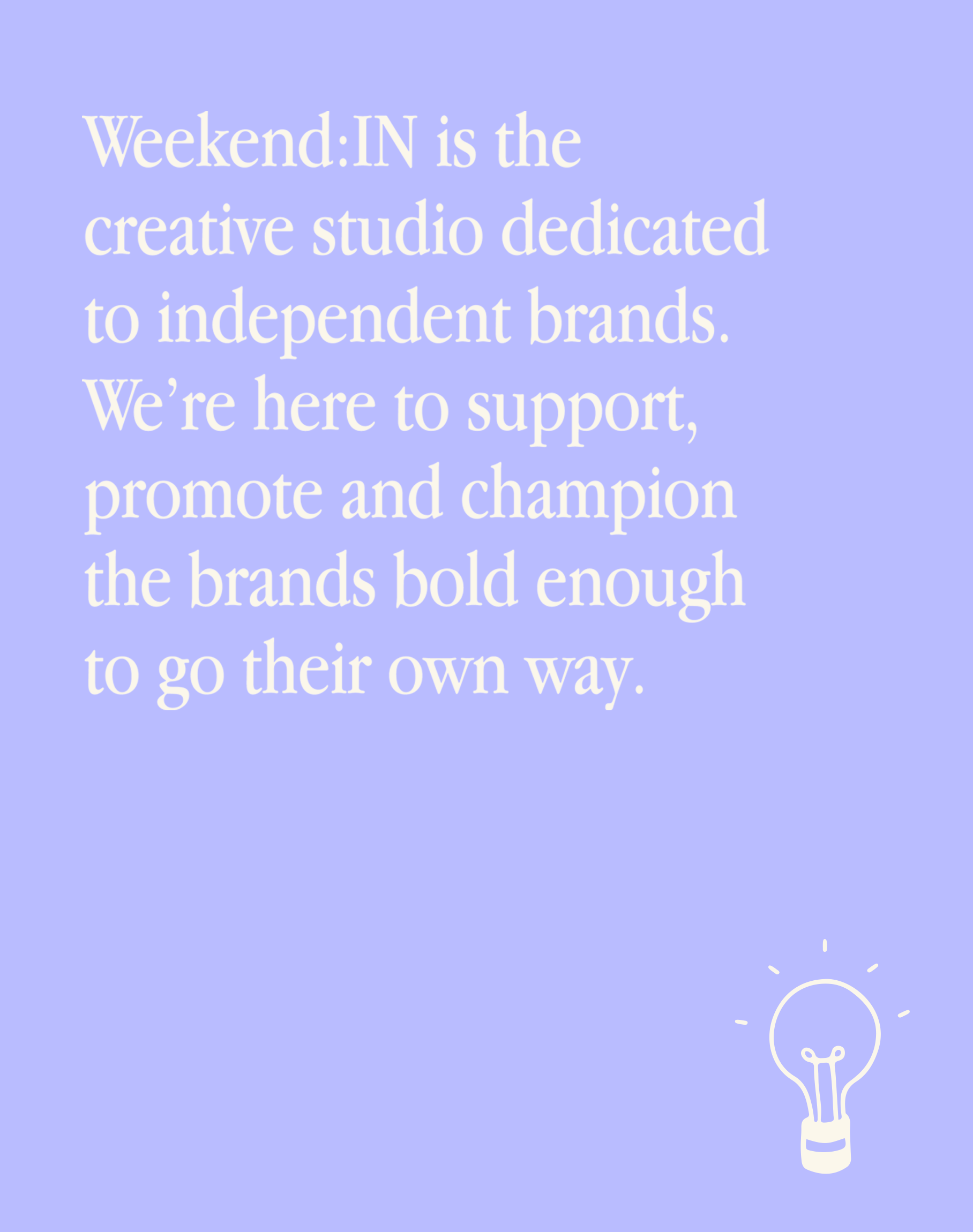
Weekend:IN, a creative studio championing independent brands bold enough to go their own way. Their new branding needed to feel sophisticated yet fun.
We created a bold, distinctive logo paired with elegant typography and editorial layouts. To bring their upbeat personality to life we designed a set of playful illustrations that can be layered into their visuals, reinforcing Weekend:IN’s positive and fun vibes.
BRAND IDENTITY // SOCIAL MEDIA // WEBSITE DESIGN + BUILD
Porter Design Strategy
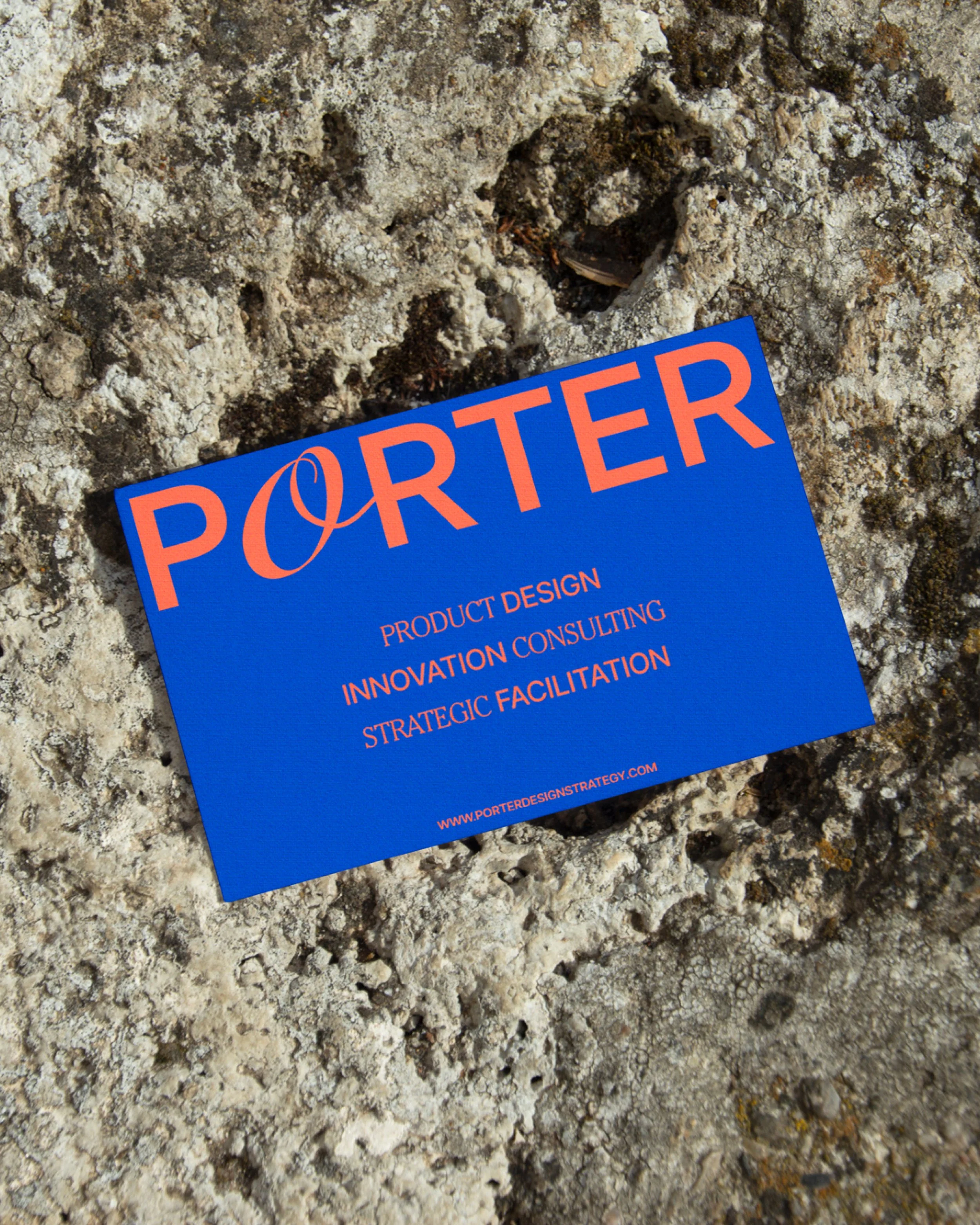
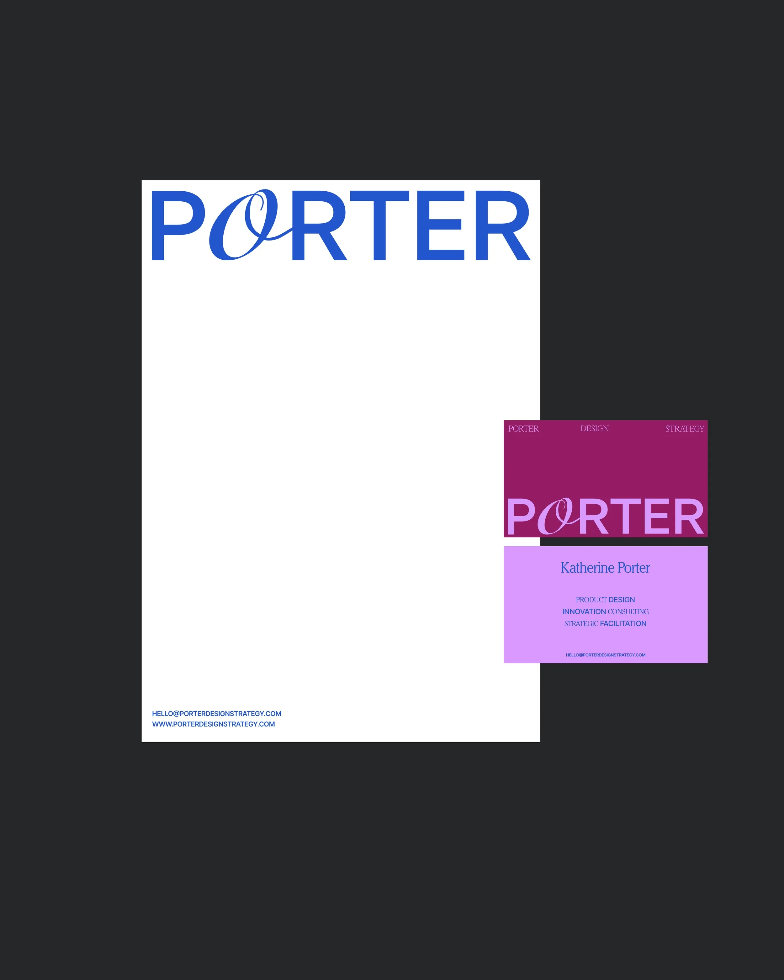
Katherine is an award-winning interdisciplinary designer and business strategist, recognised for her work in architectural design, product design, and innovation strategy.
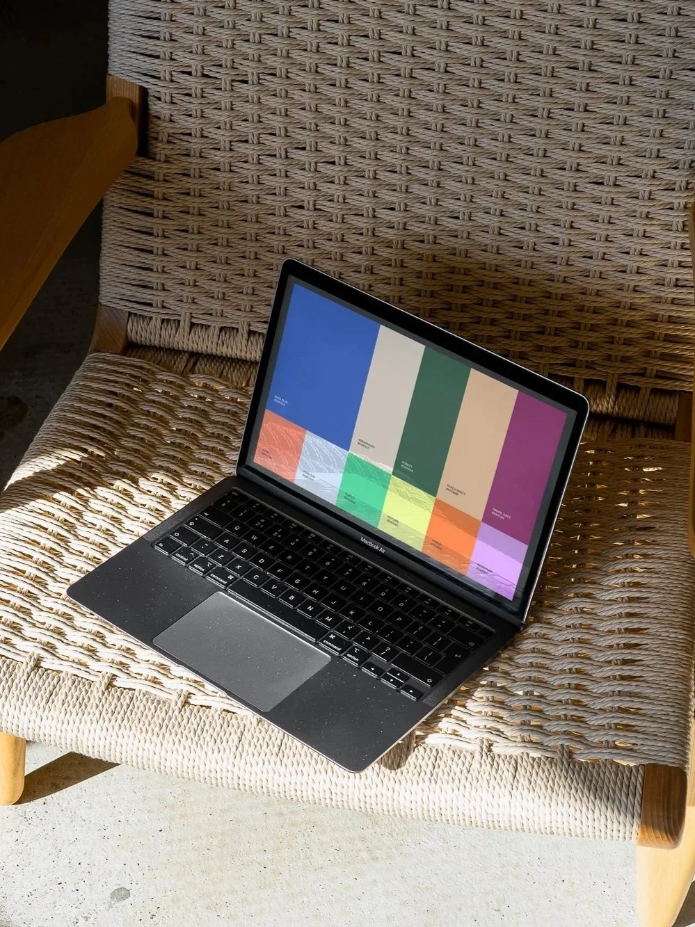
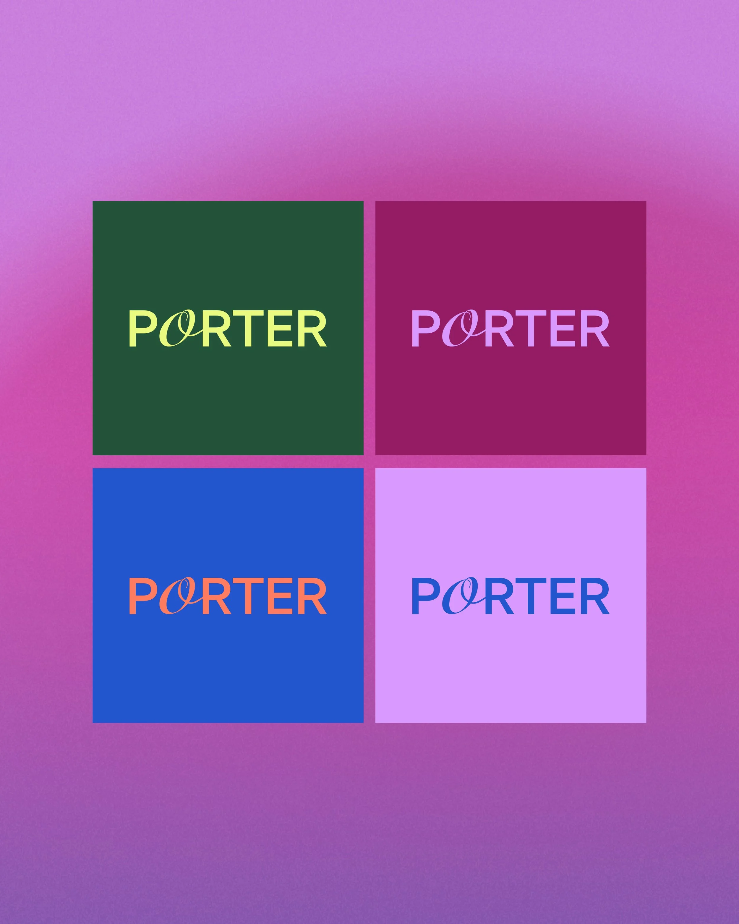
We worked together to build a creative yet professional identity, building a strong colour and logo system to excite the client. Creating a variety of colour combinations and shapes so Katherine could use the colour that best suited. Our challenge throughout was making sure the brand identity looks highly professional and trusting, yet show her forward thinking and creative services.
BRAND IDENTITY // MARKETING DESIGN // PRESENTATION DESIGN
VUYU skin
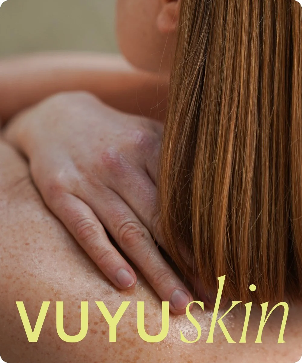
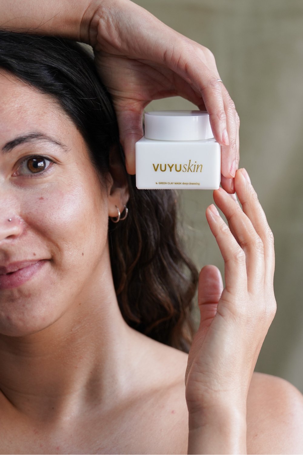
VUYU, a new skincare brand on a mission to create real, honest products rooted in natural ingredients and empowering marketing.
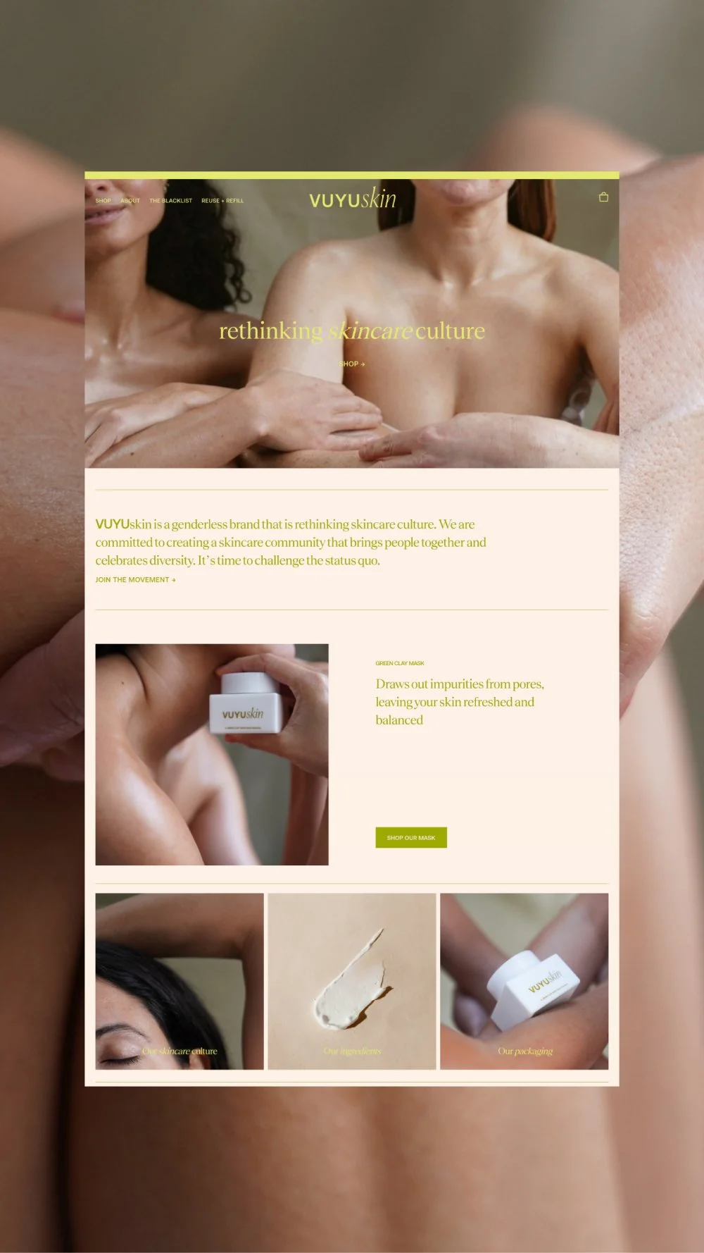
For the colour palette, we drew from nature and contrasted it with a standout lime green for a modern edge. We created minimal, clean packaging and a pared-back website that lets strong imagery and product storytelling take the lead.
BRAND IDENTITY // SOCIAL MEDIA // WEBSITE DESIGN + BUILD
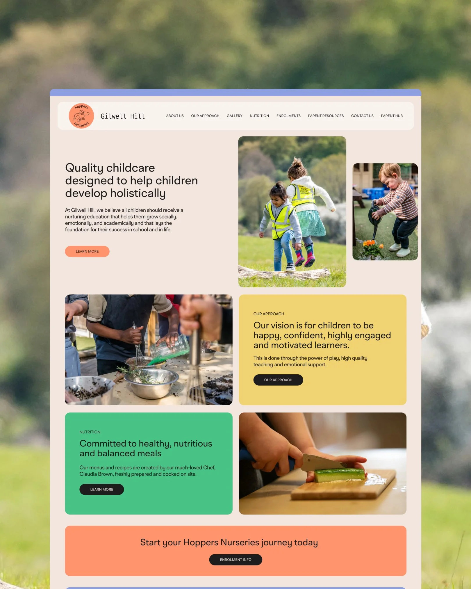
Hoppers Nurseries
Hoppers Nurseries, based in Gilwell Hill, recently welcomed a new headteacher and wanted a refreshed identity that reflects their values and vision.
They are more than a childcare setting, they are a family. The nursery prides itself on creating a close-knit, nurturing environment where children, parents and staff feel supported, valued and connected.
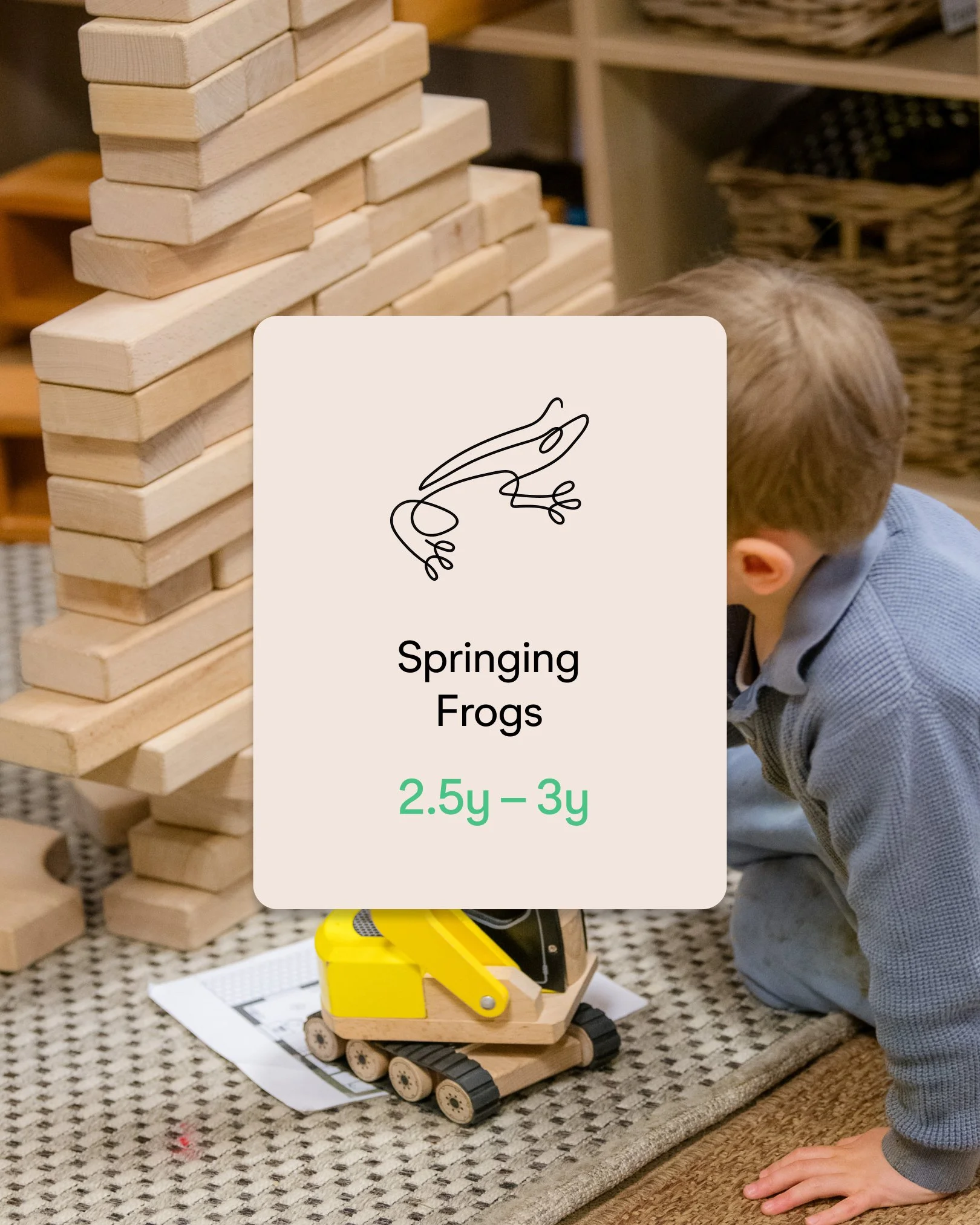
We used animals and movement into the logo and illustration style, beautifully illustrated by Marta and paired it with a nature inspired colour palette. Using pops of vibrant colour to help their classrooms and promotional materials stand out from other nurseries.


